Appearance
Top Menu
Description
Top Menu is a feature-rich, category oriented user interface, it helps you to organize groups and panoramas by categories, which are represented as icons. Use Edit-Mode to fine tune the "look and feel" of the menu right in the virtual tour without rebuilding it after every change. Easily keep and share those settings.
The plugin also included modules of additional buttons and tour text, setting for different alignment of the menu, separate settings for smaller devices, and many other options to give you as much freedom for creativity as possible.
Watch these videos to learn more about this plugin.
Compatibility
Plugin version 1.1.5
PANOTOUR PRO 2.5.12 - 2.5.14 (HTML5)
Install
The Top Menu plugin is made available as a zipped file. Before installation, remove any previous version of the plugin. Unzip the downloaded package to any temporary folder. The plugin consists of one folder alpo.topmenu_vX.X.X copy it to:Windows C:\Users\MyName\Documents\Kolor\PanotourPro 2\pluginsMac /Users/MyName/Documents/Kolor/PanotourPro 2/pluginsLinux /home/$USER/Documents/Kolor/PanotourPro 2/plugins
Restart Panotour to see the plugin!
Plugin settings
Here you can set general plugin settings, like using on devices and start actions.
Use plugin on devices
Select devices where the plugin will be working.
Click anywhere to close the pane
With this option enabled opened category pane will be closed when a user clicks somewhere on the tour, but not an active element like a button.
Add start actions
Enable to see hidden sections where you select start actions and choose on which device this actions will be executed. It's also possible to set a delay for the actions in ms, 1000ms = 1 second.
Bar settings
Main settings for menu background bar, to hide bar just set color alpha to 0 in the color settings window.
Overlapping settings
Regulates the overlapping of the menubar with other elements of the tour. Use the settings if you have issues when some element overlaps the menubar or vice-versa it appears behind the menubar, but you need it over the menubar.
Z order
Overlapping with krpano elements in the krpano context. Available values from 0 to 100. For example, If some krpano element, which is not related to the Top Menu plugin (some button, image, etc) has krpano zorder property 10, you can set Top menu Z order setting to 11 and more to see the menubar over that krpano element. Set the value lower than 10 to see the krpano element over the menubar.
Z index
The same as for Z order option, but this value sets overlapping with HTML elements, this can be, for example, div elements generated by krpano or other elements on the HTML page. In the basic tour, Z-index values of elements can be different. For example: 2000, 3001, 16800 etc. If Z order option is not set in the plugin settings, then menubar will get a default value.
Color
Bar color and opacity.
Size
Width and height of the bar. Additional values of min/max width and height to limit bar size on big or small screens.
Size for devices
Enable to use separate size for devices, if for width or height set 0, then separate size is not using for this setting. If for min/max set 0, then 0 will be using.
Position
The bar position consists of aligning and offsets. Select aligning and then offsets will be calculated from this point. It's possible to use negative values in pixels.
Offsets for devices
Enable to use separate offsets for devices, if set 0, then separate size is not using for this setting.
Left/Right Padding
A gap from left or right for bar contents.
Padding for devices
Enable to use separate padding values for devices, if set 0, then this separate padding value is not using.
Blocks of contents
The top menu has three blocks, Categories in the center, Buttons on the right, and Text on the left. Left and right blocks can have any width, but the central block width is calculated automatically and aligned to the right. On small screens, when it's not enough space for category block
- text block will be hidden.
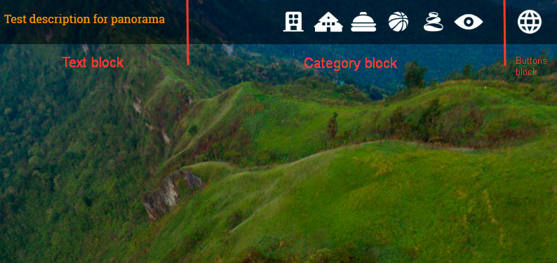
Text block
Width
The width of the text block, it affects the category block width. Additional values of min/max width to limit block size on big or small screens.
Width for devices
Enable to use separate width for devices, if set 0, then the separate value is not using for this setting. If for min/max set 0, then 0 will be using.
Contents/Default contents
Which text to display in the text block (Category and Custom descriptions see in the Advanced part). If Contents is not available, then the selection of Default contents will be shown.
Use menu font
Enable to use the same font that is set for the menu. In the description settings set any font for your text to make this option work.
Category block
Auto-scroll on hover
Category buttons are made scrollable when it's not enough space. With this option enabled, categories icons will be scrolling by hovering the mouse over them.
Category icons size
In this section, you can set Width, Height, and Gap. Gap is the distance between category buttons.
Advanced size options
Activate if you use category icons of different width. In the Width values field type width in pixels of your images in the order of created categories, separated by comma/space (Example: 69, 188, 101).
TIP
There are two additional required fields for tablet and mobile devices.
If you would like to keep the same size for devices, set the same values in the field.
Size for devices
Enable to use separate size for devices, if for width or height set 0, then separate size is not using for this setting. If for gap set 0, then 0 will be using.
Buttons block
Click for more info
Menu style
Here you can set style and behavior settings for the menu and activate Edit Mode.
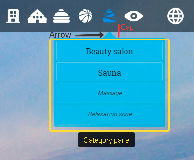
Pane settings
Settings for category pane, which appears on click category button. Pane includes Panotour groups and panoramas assigned to appropriate category in the Create categories section.
Width
Width of panes in pixels, there are separate devices settings for width.
Max height
Max height for the pane independently of how many items are assigned to it. If there's not enough height for items they will be scrollable. If set 0, then the height of the category panes will be different, depending on the number of assigned items.
Gap
The vertical gap between the category button and top of the pane, see image below.
Arrow size
Set 0 to not use the arrow on top of the pane.
Foldable groups
Enable to start with folded menu items that correspond to Panotour groups to hide panoramas items in it.
Devices settings
Enable to use separate width for devices, if set 0, then the separate value is not using for this setting. If for max height, gap, and arrow size set 0, then 0 will be using.
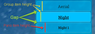
Menu items settings
Height settings for menu items, separately for group and pano items.
Gap - a vertical gap between items.
Devices settings
Enable to use a separate height for devices, if set 0, then the separate value is not using for this setting. If for gap set 0, then 0 will be using.
Generate group items first
With this option enabled items for groups will be created in the category pane first and after them, items for single panoramas will be placed.
Close active pane on new pano
With this option enabled opened category pane will be closed when new panorama is loading.
Enable Edit Mode
Enable this option and build to add Edit Mode to the tour.
Video: Using Edit Mode
Style data
Here you can paste style data from the Edit Mode.
Create categories
Categories block is the main element of the menu, every category presented by a custom icon, and it opens a pane which can include menu items related to groups and panoramas.
You can find the categories settings section at the bottom of the plugin settings interface. There's no limitation for categories quantity.
Video: Create category
Category title
This title appears as a tooltip over the category button.
Category icon/active icon
Select your images (png or jpeg) for the category. An active icon appears on hovering or clicking the category button.
TIP
For the best user experience prepare icons to be identical size and centering, also compress your images keeping the balance between file size and quality.
Since version 1.1.4 it's possible to use category icon images of different width (Useful if images have text). It's required to pass widths of the images in the setting, see Advanced size options in the Category block section.
Assign groups by color
Choose a color to specify groups that will be assigned to this category. Video: Assigning a group to a category.
Assign panoramas by ID
Type panorama IDs separated by comma/space which will be assigned to this category. Panoramas will be assigned in the order of specified IDs.
TIP
You can control which appears first, groups then panoramas or vice versa, in the category pane. There is a checkbox option for that Generate groups items first, you can find it in the Menu Style section. However, currently, there is no setting to control order which group appears as first, and which group next, the same for panoramas.
This order is controlled by ID number, the below example have a workaround for that.
Example, if you have two groups (id01, id02) and two single panoramas (id01, id02) with enabled option Generate groups items first you will get category with this order: group "Streets"(id1), group "Interiors"(id2), pano(id1), pano(id2). If you want to display "Interiors" first and then "Streets" you can duplicate group "Streets", a new identical group will be created by Panotour, it will have the latest ID (id3 in this case), then remove group "Streets" (id1). Now, in the category, you have order like this: "Interiors"(id2), "Streets"(id3), pano(id1), pano(id2).
Krpano actions on click
Input any krpano actions to execute them on clicking the category button.
For example to simply load a panorama on click the category button:
- do not attach panoramas or groups to this category
- add krpano action to load panorama by ID (e.g. pano50)
Krpano actionmainloadscene(pano50);
Edit Mode
Enable option Menu style>Enable edit mode and build the project, this will add edit mode into your tour.
Please watch the video Using Edit Mode.
Buttons block and additional buttons
Buttons block placed on the right side of the menu, it includes the "main" button and separator image.
Settings for buttons block you can find in the Block of contents settings > Buttons block.
Buttons block
Width
Width of the buttons block from the right side, it affects the category block and separator image horizontal position.
Width for devices
Enable to use separate width values for devices, if for set 0, then the separate value is not using for this setting.
Display additional icon (separator)
Enable to display a separator image and to open hidden settings for it.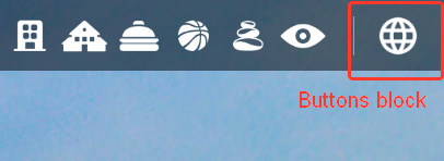
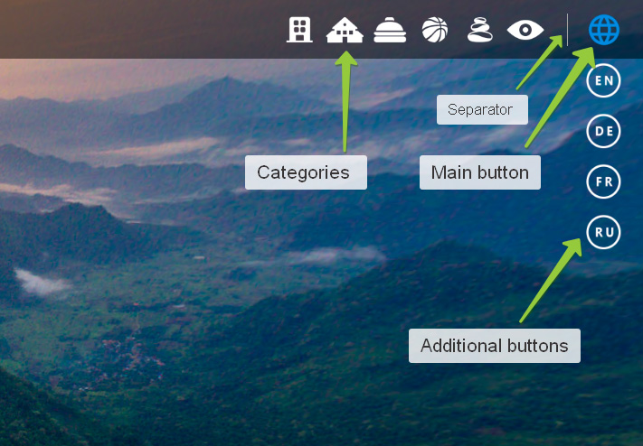
Main button
Settings for the main button you can find in the Buttons settings > Main buttons settings section.
Main button can have one of two clicking options:
- Assign any Panotour actions
- Display additional buttons
Video: Setup Main button and create additional buttons
Main button settings
Width/Height
Size of the main button
Devices settings
Enable to use separate size for devices, if for width or height set 0, then separate size is not using for this setting.
Button title
A title that appears as a tooltip.
X-offset
Horizontal position offset from the right side.
Icon/Mouse-over icon files
Select your images (png or jpeg) for the main button. The mouse-over icon appears on hovering or clicking the main button.
TIP
For the best user experience prepare icons to be identical size and centering, also compress your images keeping the balance between file size and quality.
Main button action
Select custom actions to add any Panotour actions.
Select show more buttons to display more buttons, this will show hidden sections of additional buttons settings.
Additional buttons
Additional buttons aligned vertically and hidden at start, there's no limitation for buttons quantity.
Every button can have one of Panotour actions (one action because of Panotour limitation in the plugin interface).
Additional buttons settings
Additional buttons size
In this section, you can set Width, Height, and Gap. Gap is the distance between buttons and between the Main button and the first additional.
Devices settings
Enable to use separate size for devices, if for width or height set 0, then separate size is not using for this setting. If for gap set 0, then 0 will be using.
Additional buttons creation
To create a new button duplicate Additional button section by pressing the plus icon on the right. Set individual settings in every section.
Button title
A title that appears as a tooltip
Desktop / Tablet / Mobile
Check on which device this button will be presented.
Button Icon/Mouse-over icon files
Select your images (png or jpeg) for the button. The mouse-over icon appears on hovering the button. For the best user experience prepare icons to be identical size and centering, also compress your images keeping the balance between file size and quality.
Hide all buttons on click
Enable to hide all additional buttons on clicking the button.
Button action
Assign one of the panotour action to the button.
Custom or Google font Edit mode
Google font
To use any font from Google fonts library, select Custom font in the dropdown list of the Edit mode's font option and enter the font name in the field that appears. Click the apply button to see the changes.
Custom ttf font
There is also a possibility to use custom .ttf font, this requires some additional preparation.
Select Custom font in the dropdown list of the Edit mode's font option and enter the font name in the field that appears.
To mark that the font is a custom one and that it should be loaded from your assets add an underscore before and after the font name.
So if your font name is Alex Brush it should be _Alex Brush_.
The final step should be done after the tour has been built. Add font style data into the main HTML page, this requires to open the main HTML file with the code editor software (e.g. Atom, VS code, Sublime, Notepad++). Add the following code between any style tags.
This modification will be lost after re-building the tour and you'll have to do it again.
css
@font-face { font-family: '_Alex Brush_'; src: url('./indexdata/fonts/Alex Brush.ttf'); }Add the folder fonts with .ttf file to your tourdata directory, to make font accessible with the URL that was set in the previous piece of code indexdata/fonts/Alex Brush.ttf.
Before and after editing the main html file

Troubleshooting
This section on troubleshooting to help you with common problems you might have with the plugin.
For any issue please first check that you are using the latest version of the plugin
Categories appear in the incorrect order
This can be a known Panotour bug, if you use re-ordering of the menu items in the list it generates incorrect order or duplicate names. The solution is to save a copy of the project file, open it in Panotour and remove menu items, then save the project and build to a new folder, then re-create all menu items with correct order (don't use re-ordering buttons) save and build.
Black screen on clicking the hotspot or button
This issue caused by the same reason as the Categories appear in the incorrect order
Tooltips do not work correctly
Check this video to set up tooltips as you need.
Please check that these conditions are met:
button titleorcategory titlefields are not empty, the text in these fields will be displayed as tooltips.- Check that tooltip position is not set out of the screen, use default settings at first.
Mouse over icon fileorCategory active iconfiles selected, do not set these fields empty. If you do not need an active icon, then just select the same icon file.- If you changed the order of the categories or additional buttons, remove and re-create them in the correct order. Because of the ordering bug in Panotour.
Advanced actions
You can use prepared javascript functions to control Top Menu, it's possible to call them in Panotour actions>advanced>Call a Javascript function or somewhere in your custom code.
Show / hide / Toggle visibility of Top menu
Hide, show, or toggle visibility of all the UI of the Top Menu, depending on the passed parameter.
js
alpoTM.barVisibility('parameter')parameter:
toggle- toggles visibilityshow- show if hiddenany truthy parameter- hides.
Toggle category pane
Open/Close category pane and activate/deactivate appropriate category button, depending on the parameter.
js
alpoTM.togglePane('parameter')parameter:
number- category number (see image for more info).No parameter- opened pane will be closed.
Scroll to category button
Scrolls to category button, if buttons block is scrollable. Good to use with Toggle category pane function.
js
alpoTM.scrollCategBtn('parameter')parameter:
number- category number (see the image in previous action parameter for more info).
Click main button
Executes click action of the main button. It also activates the button.
js
alpoTM.toggleMainBtn()If for the main button action selected Custom actions, you'll need to call Deactivate main button function after this, with a timeout.
Example for Panotour actions:
js
(function(){alpoTM.toggleMainBtn();setTimeout(alpoTM.deactMainBtn,100)})()Deactivate main button
Deactivates main button if needed, see more info in the information about Click main button function above.
js
alpoTM.deactMainBtn()Position of the Top Menu
Tween bar X/Y position. Position values are passed in the parameter.
js
alpoTM.barPos(parameter)Parameter:
JSON object string - '{"nX":"N", "nY":"N", "iX":"N", "iY":"N", "ttm":"TN", "ttp":"T", "tgl":"false"}'
nX- [optional] new X position, whereNis a number. Position value to tween to.nY- [optional] new Y position, whereNis a number. Position value to tween to.iX- [optional] initial X position, whereNis a number. This sets position value which will be using as initial when toggle back.iY- [optional] initial Y position, whereNis a number. This sets position value which will be using as initial when toggle back.ttm- [optional] tween time. WhereTNis a number in ms, 1000ms = 1 second.ttp- [optional] tween type. WhereTis a name of tween type.
Possible tween types:easeOutQuad,easeOutQuart,easeOutQuint,easeOutSine,easeOutBounce,easeOutCirc,easeOutCubic,easeOutExpo,easeOutBack,easeInQuad,easeInQuart,easeInQuint,easeInSine,easeInBounce,easeInCirc,easeInCubic,easeInExpo,easeInBack.tgl- [optional] Type: String. Toggle position. If set"true", then position will be toggling between new and initial position values. If initial position is not passed, first position will be saved as initial.
Example 1:
js
alpoTM.barPos('{"nY":"-100", "tgl":"true"}')This will tween Top Menu Y position from current (for instance 0) to -100 pixels and on the second execution of this function it will toggle back menu to 0.
Example 2:
js
alpoTM.barPos('{"nY":"0", "tgl":"true", "ttm":"1000"}')Put this action to the Top Menu start actions Panotour actions>advanced>Call a Javascript function and set the delay for the start action to 5000ms, set Bar settings>Position>Align to Top and Y Offset to -100px. As a result, the tour opens with the hidden Top Menu bar, because it's -100px Y position and after 5sec. The bar is tweening to 0 and appears on top of the screen. Executing this function again will tween bar to -100px out of the screen.
Calling advanced functions
You can call several functions with timeouts, for instance, tween bar, then open category pane after 500ms.
Example:
js
alpoTM.barPos('{"nY":"0", "tgl":"true", "ttm":"900"}');setTimeout(alpoTM.togglePane,1000,2)Here 1000 is a delay in ms and 2 is a parameter, in this case, the category index. But this works in Javascript code and not in Panotour actions>advanced>Call a Javascript function.
For Panotour it should be adapted, see below.
Example for PTP:
js
(function(){alpoTM.barPos('{"nY":"0", "tgl":"true", "ttm":"900"}');setTimeout(alpoTM.togglePane,1000,2)})()Although single function will work in Panotour - js alpoTM.togglePane(2), for more calls we have to wrap them in a function.
Open krpano log
Open krpano log with URL parameter log (www.example.com/tour.html?log).
To see if any errors or warnings there.
The top menu adds some messages to the log about the version number of the plugin, and if any issues with assigning panoramas or groups to categories.