Appearance
Sidebar
Description
The Sidebar plugin extends a virtual tour with a user interface that automatically organizes panoramas and groups in a scrollable list with names and thumbnails. The plugin allows for extensive customization.
Video overview
Compatibility
Plugin version 1.2.0
PANOTOUR PRO 2.5.12 - 2.5.14 (HTML5)
Install
The Sidebar plugin is made available as a zipped file. Before installation, remove any previous version of the plugin. Unzip the downloaded package to any temporary folder.
The plugin consists of one folder alpo.sidebar-x.x.x copy it to:Windows C:\Users\MyName\Documents\Kolor\PanotourPro 2\pluginsMac /Users/MyName/Documents/Kolor/PanotourPro 2/pluginsLinux /home/$USER/Documents/Kolor/PanotourPro 2/plugins
Restart Panotour to see the plugin!
General Settings
Devices
Use Sidebar only for specified device or group of devices. For example, to display Sidebar only on desktop - type desktop in the field. Or to display Sidebar on tablet or mobile devices - type tablet|mobile. All the available options can be found here.
Color
Background color of the Sidebar. Supports transparency.
Z-index
Setting to display Sidebar over or under other elements of the page (like header, footer, panorama menu, etc). Lower value sets Sidebar under elements, higher value brings it over elements.
Width
Width of the sidebar. If you change the default value, then set appropriate values in the menu settings section for menu width, thumbnails height, and Back button width (for HT menu).
Specify width for devices
Enable to set separate width for tablets and mobiles.
On tablets / On mobiles
Set width values. Set 0 to use general width.
Select Sidebar aligning
Sets Sidebar alignment to the left or right side of the screen.
Open Sidebar when tour starts
Sets Sidebar to open when a tour starts. This happens only once when the tour starts.
Except mobiles
If enabled, then Sidebar will be opened when tour starts on all devices except mobiles.
Close Sidebar on every new pano
Sets to close Sidebar every time a new panorama is loading.
Thumbnails container won't be closed, if you'd like to close thumbnails container, enable Close thumbnails container on new pano in the Thumbnails container settings.
Mobiles only
Enable to close Sidebar every time a new panorama is loading, but only on mobiles. Sidebar will stay open on other devices.
Display settings for actions done when open / close Sidebar
Enable to display action settings. Set actions will be called whenever Sidebar opens/closes.
Blocks Settings
This section is hidden by default, to display it enable Display block settings option.
Add Block
Block is an element inside Sidebar that can handle selected content or can remain empty. Blocks are located from top to bottom: block1 is the top block then block 2 goes under it and so on. By setting the size of the blocks and assigning them one of the pieces of selected content you can position elements inside Sidebar. It is possible to add up to 5 blocks in Sidebar. The blocks must be added one after the other.
Select content
Sets content for the block.
Selecting the equal content in several blocks is not recommended, except Empty.
Available contents:Empty this setting can be used to set empty space in the SidebarLogo adds a logo to the block.Logo 2 same as Logo, adds the ability to display the second logo in Sidebar.Current panorama name adds the name of the current panorama to the block.Current panorama description adds a description of the current panorama in Sidebar.Project description adds a description of the project in Sidebar.Menu adds a menu in Sidebar.Buttons adds buttons in Sidebar. Up to 10 buttons available. First, enable the Setup buttons setting and then use Buttons settings and Add buttons sections.
Settings for the contents are set below.
Block height
Sets percentage height of the block. Percentage calculated based on tour container height.
Block top margin
Sets block top indent in pixels from the element above.
Block minimum height
Sets a minimum limit for the block height in pixels. Set 0 to ignore this setting. Set the same value to the minimum height and maximum height to set a fixed-sized block.
Block maximum height
Sets a maximum limit for the block height in pixels. Set 0 to ignore this setting. Set the same value to the minimum height and maximum height to set a fixed-sized block.
Block background color
Sets background color and transparency for the block. Useful to preview the location and size of the blocks.
Set auto-height for block
The auto-height block fills the free space in the Sidebar, that is not used by other blocks.
Block number
Sets which block uses auto-height.
Open / Close Sidebar settings
Settings for the open / close Sidebar functionality. This section is hidden by default, to display it enable "Display Open / Close Sidebar settings" option.
Icon
Sets which image to use for the open/close Sidebar button.
Available parameters: default to use default graphics and custom to set your own graphics.
Choose file custom
Select a graphic file for the button (png, jpeg).
Over state
Sets to change open/close Sidebar button in the active state (mouse-over or on-press on touch devices).
Over icon
Sets which icon to use in the active state. Available parameters: default to use default graphics and custom to set your own graphics.
Choose file custom
Select graphic file (png, jpeg).
Open state
Sets to change open/close Sidebar button icon while Sidebar is open.
Open state icon
Sets which icon to use for the button to close Sidebar. Available parameters: default to use default graphics and custom to set your own graphics.
Choose file custom
Select graphic file (png, jpeg).
Over state (if Sidebar is open)
If an open state icon is selected for the button, it can also have an active state when Sidebar is open (mouse-over or on-press on touch devices).
Over icon
Sets which over icon to use for close button (if open state icon enabled). Available parameters: default to use default graphics and custom to set your own graphics.
Choose file custom
Select graphic file for close button in active state (png, jpeg).
Icon position
Sets vertical position for the open/close Sidebar button on the screen. Available positions: Top, Center, Bottom
Offset
Sets open/close Sidebar button offset in pixels from its position. x sets horizontal offset, y sets vertical offset.
Separate position for open state
Sets the separate position and offset for the open/close Sidebar button when Sidebar is open.
Open state position
Sets vertical position for the button on the screen when Sidebar is open. Available positions: Top, Center, Bottom
Offset
Sets the button offset in pixels from its position when Sidebar is open. x sets horizontal offset, y sets vertical offset.
Icon opacity
Sets opacity for the open/close Sidebar button in percent. Available values: 10 - 100%
Separate opacity for open state
Enable to set the opacity for the open/close Sidebar button when Sidebar is open.
Icon opacity
Sets opacity. Available values: 10 - 100%
Hide on click and show with delay
Sets to hide open/close Sidebar button on click and then show it with a delay.
Delay
The time period in milliseconds to wait after hiding the button before display it again.
Invisible opener (mouse over)
Adds an invisible element that opens Sidebar on mouse over near the edge of the screen where Sidebar is positioned.
Close on screen-click
Enable to be able to close Sidebar by clicking anywhere in the tour, except active elements like buttons, etc.
Logo settings
Settings for logo image placed in a block of the Sidebar.
This section is hidden by default, to display it enable Display Logo settings option.
Logo
Choose an image for the logo (png, jpeg). Depending on the block size the logo image will be resized automatically inside the block keeping the aspect ratio.
Align Logo in a Block
Sets logo image aligning in the block. Available values: Top, Bottom.
Choose an action
Sets actions to call on click logo.
Logo 2 settings
Settings for logo2 image placed in a block of the Sidebar.
This section is hidden by default, to display it enable Display Logo settings option.
Logo 2
Choose image for logo (png, jpeg). Depending on the block size the logo image will be resized automatically inside the block keeping the aspect ratio.
Align Logo in a Block
Sets logo image aligning in the block. Available values: Top, Bottom.
Choose an action
Sets actions to call on click logo.
Current pano description settings
Displays description of the current viewing panorama inside the selected block of the Sidebar.
The description should be set in the description field at the TOUR tab of the Panotour Pro.
This section is hidden by default, to display it enable Display settings for current pano description option.
Align description text
Sets text alignment inside the element. Available values: Left, Right, Center.
Padding
Sets text indent of the description element edges. Default value: 8px.
Background
Adds color background for the description element.
Color
Sets description element background color and opacity.
Project description settings
Displays description of the project inside the selected block of the Sidebar. The description should be set in the description field at the TOUR tab of Panotour Pro.
This section is hidden by default, to display it enable Display settings for current pano description option.
Align description text
Sets text alignment inside the element. Available values: Left, Right, Center.
Padding
Sets text indent of the description element edges. Default value: 8px.
Background
Adds background for the description element.
Color
Sets description element background color and opacity.
Setup buttons
Enable to display sections for adding and setting-up buttons.
Buttons settings
Group of settings to set buttons styling.
This section is hidden by default, to display it enable Display buttons settings option.
Buttons size and visibility can be set separately for tablet or mobile devices.
Buttons size
Sets size for all buttons in pixels.
Button width
Sets buttons width
Button height
Sets buttons height
Button margin
Sets indent between buttons horizontally and vertically.
Buttons color
Sets color and opacity for buttons background.
Buttons roundness
Sets roundness for buttons background corners in pixels.
Can be set separately for Tablet and Mobile devices.
Icon scale relative to button
Sets icon file of the button to be scaled relative to the button size. If disabled, the icon will have the original size and will be cropped by button edges.
Scaling
Percentage value to scale buttons icon. Maximum value 100%, minimum value 0, default value 80%.
Add border
Displays a border around the button background.
Border color
Sets color for button border.
Border width
Sets width for border line.
Add hover effect
If enabled, shows the effect upon mouse-over or on-press on touch devices.
Change border color
Changes the color of the button border.
Active border color
Sets the border color that will be used when active e.g. it appears upon mouse-over or on-press on touch devices.
Change buttons color
Changes the background color of buttons.
Active buttons color
Sets the color that will be used when active e.g. it appears upon mouse-over or on-press on touch devices.
Use custom tooltip style for buttons
Enables style for tooltips.
Custom tooltip style settings
Available optionsFont, Color, Background, Border width, Effect, Round edge
Buttons aligning in a block
Sets alignment of the buttons inside the block.
X-offset
Sets horizontal offset for buttons.
Add buttons
In this section, you can add up to 10 buttons and assign individual parameters for them.
Buttons are distributed in two rows:
Row 1 - buttons from 1 to 5.
Row 2 - buttons from 6 to 10.
If you want to add, for instance, three buttons in one row, then you must add 1, 2, 3 buttons.
If you want to add, for instance, two buttons one under another, then add button 1 and button 6.
To set individual parameters click on the button name and set it in the appropriate Button settings section (on the right hand).
Button 1 - Button 10
Select which buttons to display in the Sidebar.
Button settings
Settings that can be assigned individually for every button. To set buttons parameters click on the button name.
Button icon
If a file is selected it will appear in the center of the button in accordance with the scale settings.
Hide on desktop
If enabled, this button is hidden on the desktop. The position of any other buttons will be calculated accordingly.
Hide on tablet
If enabled, this button is hidden on tablet devices. The position of any other buttons will be calculated accordingly.
Hide on mobile
If enabled, this button is hidden on mobile devices. The position of any other buttons will be calculated accordingly.
Display tooltip
If enabled, this displays tooltip text with either default or custom style.
Tooltip
Tooltip text for button
Choose an action
Choose actions for button click.
Add button toggle actions
If enabled, this sets toggle actions (upon every second click) for buttons. Use it for buttons that need to enable/disable something. For instance, if the button action is set to start auto-rotation, then you should set toggle action to stop auto-rotation.
Button icon
if a file is selected, the button icon will be changed accordingly.
Choose an action
Choose actions for every second button click.
Current pano name
Panorama name prefix text.
The text to display before the name of the current panorama.
Default value Current Panorama
Display more settings for Current pano name
The settings section is hidden by default, enable the checkbox to display it.
Align text layer in a block
Sets alignment of the layer in a block (not the text inside this layer, as this setting is below).
X-offset for text layer
Sets horizontal offset for the layer. The offset side depends on the text layer horizontal alignment.
Text settings
Settings for text inside the text layer.
Font Sets one of the available fonts for the current pano name text. Default font Trebuchet MS.
Color
Sets text color.
Font size
Sets font size.
Text align
Sets text alignment inside the text layer.
Underline / Bold / Italic
Decoration for text.
Additional Text settings (for name only)
Sets each of font size, color, underline, bold, italic separately for panorama name part of the text.
Menu type
Available two types of menu.
Menu with thumbnails container (TC)
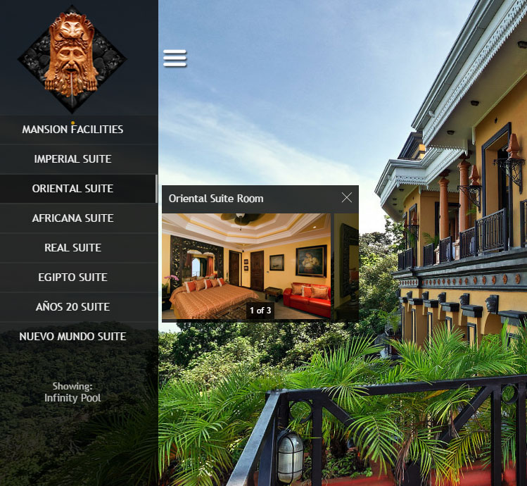 Organizes panoramas and groups into a scrollable list with text menu items. Items display group names and single panoramas names. On click item, it opens the thumbnails container element with a scrollable list of thumbnails. Settings for this menu are divided into two parts: menu settings and thumbnails container settings, to display them enable appropriate options below.
Note about thumbnails in a container
Thumbnails are created automatically from panoramas. These appear cropped a little to exclude the bottom, which is not always retouched. You can set your own thumbnails. Prepare your images with the following sizes: 240x150px for groups; and 280x150 for panoramas without groups. To change the default thumbnails, go to your panorama settings in the TOUR tab in Panotour Pro. You can see the thumbnail on the left of the panorama name; click on it to select your thumbnail file. It's recommended that you save all of your graphics for virtual tours with the option 'Save for web and devices' in Photoshop, or with a similar option in other software. This provides a good balance between quality and file size.
Active menu (only if Sidebar is open)
Sets sidebar menu to react upon loading panoramas from other plugins/elements of the tour (prev/next buttons, click on hotspots, etc.).
Menu settings (TC)
Enable Display menu settings to open this section.
Display menu text settings
Enable to open the Text settings section.
Text settings
Font
Sets font for menu items. Default font: Trebuchet MS
Setup custom font for Sidebar
Color
Sets text color for menu items.
Font size
Sets font size for menu items.
Background color
Sets background color for menu items.
Menu text aligning
Alignment of the text of menu items.
Text offset
Shift text of menu items.
Underline / Bold / Italic
Additional text decoration
Display buttons to scroll menu
Displays buttons to scroll the menu. The button automatically hides if reached the end of the area.
Scroll buttons settings
Background color
Sets color and opacity of the buttons background.
Background width
Sets width of the button (background)
Background height
Sets height of the button (background)
Horizontal buttons alignment
Set horizontal alignment for buttons inside the scrollable area
Buttons opacity
Sets opacity for button image, not for button background (for background use Background color)
Default Buttons
Enable to use default arrows buttons.
Default Buttons color
Sets color for default arrow buttons.
Custom buttons (Default Buttons disabled)
If default buttons disabled you can select your own images for buttons.
Top scroll button
Set your image for top scroll button
Bottom scroll button
Set your image for bottom scroll button
Mouse over/tap behavior
Enable to set your buttons to react on mouse hover.
Change background color / opacity
Set to change background color and opacity on mouseover.
Change buttons opacity
Set to change buttons (image) opacity on mouseover.
Display borders
Set to display borders around the menu item
Border settings
Border color
Choose a color for borders
Border width: Top, Right, Bottom, Left Sets width for borders in pixel, separately for every side.
Display advanced settings (TC)
Enable to open the advanced settings section.
Advanced menu settings (TC)
Menu text item height
Height of each item in the menu in pixels.
Space between items
Space in pixels between items on the menu.
Menu horizontal offset
Horizontal offset of each item.
Width of the menu
Width of each item in the list.
Separate settings for tablets / mobiles
Enable to activate separate advanced settings for devices.
Add scroll indicator
If enabled, this displays a scroll indicator if the menu is scrollable. (This depends on the screen height of the device).
Scroll indicator settings
Indicator color
Sets the color and opacity of the scroll indicator.
Indicator width
Sets the width of the scroll indicator and scroll bar.
Background scrollbar
If enabled, this displays color settings for the scroll bar (indicator) background.
Background scrollbar color
Sets color and opacity for scroll bar (indicator) background.
Behavior
If enabled, this activates and displays behavior settings for the menu.
Change background color (Mouseover)
Sets the color and opacity for the active state of menu items (mouse-over and opened items).
Display active group line
If enabled, this activates and displays active group line settings.
Color
Color and opacity of the line.
Width
Width of the line.
Add icon over active group line
Choose an image file to display over the line.
Mark text menu item of current pano
If enabled, this displays a marker on the current item. (Current group or panorama if no group set).
Marker settings
Marker file
Sets up the image file for markers (png, jpeg).Default (Circle image) enables Color settings to change the color of the default marker.Custom enables file settings to choose your own image file for marker.
Settings
Sets the default settings for markers. If not enabled, activates custom settings and display the custom settings section.
Custom settings:
Marker position
Sets position of the marker relative to the menu item.
Scale down
Sets the scale for marker image files.
Default value: 50%. For instance, if the image file is 48x48px it will be displayed as 24x24px with the default setting. If you change scale setting to 100% it will be displayed as 48x48px.
Y offset
The vertical shift of the marker image relative to menu items.
Display thumbnails container settings
Displays menu thumbnails container settings.
Thumbnails container settings
Also see Note about thumbnails in container
Container background color
Sets the background color for thumbnail containers.Auto the color and opacity of the sidebar will be used.Custom manually set color and opacity.
Close icon
Select an icon to close the thumbnails container.
Style
Available style options for close icon: Default Black, Default White, Custom.
Scale
Sets the size of the close icon in percentage.
Opacity
Sets close icon opacity as in percentage.
Margins
Indents the thumbnails container from the sidebar edge and indents thumbnail inside the container.
Mark current panorama thumbnail (display icon)
Enables the display of an icon over the thumbnail of the currently displayed panorama.
Available options: Default - Eye icon, Custom - add your own icon.
Overlay inactive thumbnails
Enables an overlay over the inactive thumbnails.
Overlay color
Select the overlay color and opacity
Display buttons to scroll thumbnails
Displays buttons to scroll thumbnails. The button automatically hides if reached the end of the area.
Background color
Sets buttons background color and opacity.
Background width
Sets button width (background)
Background height Sets button height (background)
Vertical buttons aligning
Set vertical alignment for buttons inside the scrollable area
Buttons opacity
Sets opacity for button image, not for button background (for background use Background color)
Default Buttons
Enable to use default arrows buttons.
Default Buttons color
Sets color for default arrow buttons.
Custom buttons (Default Buttons disabled)
If default buttons disabled you can select your own images for buttons. Left scroll button
Set your image for left scroll button
Right scroll button
Set your image for right scroll button
Mouse over behavior
Enable to set your buttons to react on mouse hovering.
Change background color/opacity
Set to change background color and opacity on mouseover.
Change buttons opacity
Set to change buttons (image) opacity on mouseover.
Display number of total panoramas (for selected group)
Enables the display of a thumbnail number of the total panoramas in the group. In this format: "1 of 5". Displays over the thumbnail.
Prefix for total number
Sets the prefix for the total number. Default value: " of " - this will result as "1 of 5" (in case of 5 pano in a group).
Font size
Sets font size for the text.
Font color
Sets color for the text.
Y-offset
Shifts text vertically.
Padding
Sets text indent, (useful when using backgrounds).
Opacity
The opacity of the layer with text and background.
Background
Enables the setting of a background for text.
Background color (Background: enabled)
Sets the color and opacity of the background.
Round corners
Sets the roundness for background corners.
Border
Enables the adding of a border to the background.
Border color
Sets the color of the background border.
Border width
Sets the width of the background border.
Display panorama name over thumb
If enabled, this displays the name of the panorama above its thumbnail.
Panorama name text settings
Font size
Sets the font size for name text.
Select position
Selects the position of the name text inside the thumbnail container. X-offset
Shifts the name text horizontally.
Hide for single panoramas
If enabled, the name text will be hidden for single panoramas (those without a group).
Activate lightbox style for thumbnails container on devices
If enabled, this displays thumbnails container separately of the Sidebar. It appears on the center of the screen with a colored background. This option will be activated on selected devices.
Screen overlay color
Sets color and opacity for the screen overlay (background) that appears behind the thumbnails container.
Close sidebar on display thumbnails
Enable to close the sidebar every time when thumbnails container appears.
Open sidebar on hide thumbnails
Enable to open sidebar on every close of thumbnails container.
Select devices to apply the settings
Select devices on which to use this setting.
Close thumbnails container on new pano
Sets up the closure of thumbnail containers upon the loading of every new panorama.
Close only if sidebar is closed
Sets up the closure of thumbnail containers upon the loading of every new panorama only if Sidebar is closed at the moment.
Select devices to apply the settings
Sets the devices on which to close thumbnail containers.
Load main pano when open thumbnails container
If enabled, the main panorama of the group will be loaded upon the click on a menu item.
Do not display thumbnails container for single panoramas
If enabled, new panoramas will be loaded upon the click on a menu item, without opening the thumbnail container.
Display description ( if exist ) under thumbnail
If enabled, this displays panorama descriptions under thumbnails, only if a panorama has a description set in Panotour Pro. This is made with the idea of using short descriptions.
Hierarchical menu with thumbnails (HT)
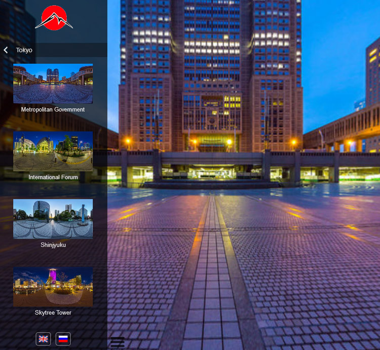 Organizes panoramas and groups into a scrollable list with text menu items and thumbnails inside Sidebar. It is possible to create custom items that can open other inner items, groups, and panoramas. It can have many nested levels.
Menu settings (HT)
Enable Display menu settings to open this section
Color settings
Menu items background color
Sets background color for menu items.
Active menu highlight background color
Sets the background color for the currently active menu item. The Active menu option should be enabled.
Borders settings
Display borders around menu items
Set to display borders around the menu item
Border color
Choose a color for the borders
Border width: Top, Right, Bottom, Left
Sets width for borders in pixels, separately for every side.
Round edge: Top, Right, Bottom, Left
Sets round edges in pixels, separately for every side.
Active menu highlight border color
Choose color for borders of the active menu item.
Active menu highlight border width: Top, Right, Bottom, Left
Sets width for borders of the active menu item in pixel, separately for every side. Recommended using the same values as in the Border width option.
Icon settings
Display icon with menu items
If enabled, it displays an icon inside the menu item.
Align Icon
Set icon alignment.
Icon X-offset
The horizontal shift of icon image.
Icon Y-offset
The vertical shift of icon image.
Icon scale
Percentage scaling of the icon image.
Default icon Enable to use the default arrow icon
Default icon color
Sets color for the default icon
File (Default icon: disabled)
Select your image for menu items icon
Specify icon
Enable to open settings of individual icons. Use the + button to create many icons and assign them to different menu items.
Note: Panotour have a bug on reordering created items, if you have issues with icons, please recreate icon items.
Icon file
Select icon file
Specify custom items
Set which custom items of the menu will have this icon file. Enter custom item indexes separated by a comma.
Specify group names
Set which group items will have this icon file. Enter group names, exactly as in the Tour Tab group name, separated by a comma.
Specify panorama IDs
Set which panorama items will have this icon file. Enter panoramas IDs (only digits for versions less than 1.1.0) separated by a comma.
Text settings
Font
Sets the font for menu items.
Default font: Arial
Setup custom font for Sidebar
Font color
Sets text color for menu items.
Font size
Sets font size for menu items.
Menu text alignment
Alignment of the text of menu items.
Text padding
Shift text of menu items.
Underline / Bold / Italic
Additional text decoration
Mouse over/tap behavior settings
Change background color of menu item
Enable to change the color of the menu item when tap on it or mouse hovering. Set color.
Thumbnails settings
Section to set parameters for thumbnails that appear with menu items.
Thumbnails height
Sets height for thumbnails the width will be set relatively, keeping the aspect ratio.
Thumbnails horizontal aligning
Sets alignment for thumbnail inside the menu.
Thumbnails horizontal offset
Sets horizontal offset for thumbnail in pixels.
Text display settings
Settings to set the position of the text (e.g. panorama name) under or over the thumbnail.
Or display only thumbnails and hide text with panorama name.
Menu items top padding
Sets indent for content inside items, from the top.
Menu items bottom padding
Sets indent for content inside items, from the bottom.
Margin between thumbnails and text
Sets indent between thumbnails and text
Separate thumbnails settings for tablets / mobiles
Enable to activate separate thumbnails settings for devices.
Back button settings
Settings for the top menu button that exit to the previous level.
Width
Sets button width
Height
Sets button height
Separate size settings for tablets / mobiles
Enable to activate separate size settings for devices.
Bottom margin
Sets bottom indent of a button from menu items
Button align
If the width of the button is set smaller than the menu, align setting can help to achieve the desired horizontal position of the button inside the menu area.
Display background
Enable to display background for the button.
Background color
Sets background color of the button. Change background on mouse over/touch
Enable to change background on touch or mouse hovering
Background color
Sets the active background color of the button to be displayed on mouse hovering or touch.
Display icon
Enable to display icon with the back button.
Use default icon
Use the default icon in the button. By default, the arrow icon is used to represent the exit from the current level.
Icon color (Display default icon: enabled)
Sets color for the default icon.
Choose icon file (Display default icon: disabled)
Choose your icon file (png, jpg).
Icon size
Sets width and height of the icon.
Display text (in the back button)
Enable to display text in the back button.
Back button text settings
Back button text
Select which text to display in the back button, Group name or any custom text.
Font color
Sets color for the text.
Font size
Sets font size for the text.
Underline / Bold / Italic
Additional text decoration
Horizontal text alignment
Horizontal text alignment inside the exit button.
Vertically center text
Sets text on the vertical center of the exit button.
Padding settings
Sets text indent separately for every side.
Scroll buttons settings
Same as here
Scroll indicator settings
Same as here
Display advanced settings
Displays advanced settings.
Advanced menu settings
Menu text item height
Height of each item in the menu excluding thumbnail settings.
Space between items
Vertical offset between items in the menu.
Menu horizontal offset
Horizontal offset of each item.
Width of the menu
Width of all items on the menu.
Group as text items
Displays items without thumbnail, for items that represent groups.
Pano as text items
Displays items without thumbnail, for items that represent panoramas.
Custom items as text
Displays items without thumbnail, for custom items.
Separate settings for tablets / mobiles
Enable to activate separate advanced settings for devices.
Load pano on click on group
If enabled, then clicking on the item that represents a group will load the main pano of that group.
And open group menu
Enable to execute opening the group level together with loading the main pano of the group.
Active menu
Sets the hierarchical menu to react upon loading panoramas from other plugins/elements of the tour (prev/next buttons, click on hotspots, etc.).
Enable on
Select when the Active menu option will be enabled
Tour start
Active menu enabled on tour start. The appropriate menu item will be opened.
Next scene
Active menu disabled on tour start and shows the initial state (main level).
On loading the next scene Active menu will be enabled.
Call
Active menu disabled on tour start and can be activated later by Javascript call.
More info about enable/disable Active menu with Javascript (from v1.1.0.)
Hierarchical menu organizing
Sets menu organizing. Available options: Default, Custom.
Default
Sets the default panotour two-level menu structure - Group > Panorama list.
To keep the original tour ordering of the groups and panoramas disable option pano over group below.
Custom
Opens the settings to set custom menu items with the ability to create sub-levels.
Using the custom organizing explained in this video
Ignore not assigned groups and panoramas
If enabled, then only the custom menu items will be visible in the menu with groups and non-grouped panoramas, which are assigned to the custom items.
Pano attached by action
A custom hierarchical menu item if it only has the attached action go to pano and has no attached pano or groups will not be highlighted when active by default.
Enable this checkbox to highlight such items on their activation.
Pano over group
If enabled, pano items will appear before (upper) group items in the menu.
Disable to keep the original tour ordering of the groups and panoramas for the Default organizing option.
Group over custom
If enabled, group items will appear before (upper) custom items in the menu.
Settings for custom item.
Note: Panotour have a bug on reordering created items, if you have issues with menu items ordering in the tour, please recreate items with needed order.
Item Title
Sets the title of the item on the menu.
Image file
An image that will be displayed with the item in the menu (as a thumbnail for default items), if not enabled custom items as text in the advanced settings.
Assign custom items by index
Set any custom item as a sub-level of this item, using their indexes. Enter indexes of the sub-level custom items, separated with comma or space. Any custom item can be assigned once to the only one custom item.
Assign groups by color
Sets panotour groups as sub-levels of this item. Choose any color and copy its index, then set this index to the color settings of the selected groups in the Tour tab.
Assign single panoramas by ID
Sets non-grouped panoramas as sub-levels of this item. Enter panorama ID (digit only for versions less than 1.1.0) separated with comma or space. Any non-grouped panorama can be assigned once to the only one custom item.
Additional actions done on click
Choose an action that will be executed on click. Only one action is possible to add here due to the limitation of the Panotour Pro.
Exclude panoramas from hierarchical menu by ID
Type pano IDs that you'd like to remove from the menu, separated by comma (e.g pano12, pano15).
Note: Single panoramas which assigned to custom menu items won't be removed.
Active menu closes Sidebar if an excluded pano is loading
When excluded pano is loading by clicking on a hotspot, button, etc, and this pano is not presented in the menu, then it closes the Sidebar.
Active menu returns to initial state if an excluded pano is loading
When excluded pano is loading by clicking on a hotspot, button, etc, and this pano is not presented in the menu, then the menu goes to the initial state without highlighting any item.
Display Sidebar info in the context menu
If enabled, displays a tiny note "Made with Sidebar" in the context menu, and links to Sidebar web page. It is enabled by default. I'd be very thankful if you'd leave this option enabled!
Custom font
It's possible to add custom font for Sidebar text. To make this, in the menu settings > text settings select custom in the dropdown fonts list.
In the appeared field Font name write the name of your font (e.g. Alex Brush).
After the tour is exported add font style data into the main HTML page, this requires opening the main HTML file with the code editor software (e.g. Atom, VS code, Sublime, Notepad++).
Add the following code between any style tags.
This modification will be lost after re-building the tour and you'll have to do it again, so it's recommended to make this in the last stage.
css
@font-face { font-family: 'Alex Brush'; src: url('./indexdata/fonts/Alex Brush.ttf'); }Add folder "fonts" with .ttf file to your tourdata directory, to make font accessible with the URL that was set in the previous piece of code indexdata/fonts/Alex Brush.ttf.
See image before and after editing the main html file
Custom actions
Sidebar comes with a set of custom actions that can be assigned to click-able elements (plugins) that are in the Panotour Pro (Simple button, Toggle button, Hotspots, etc.).
Actions are accessible in the Choose actions dialog in Panotour Pro, under the collapsible element [Plugin] Sidebar.
Available actions
Toggle open/close Sidebar
Opens or closes Sidebar depending on its state.
Close Sidebar
Action to only close Sidebar. If Sidebar is already closed, no action will be taken.
Open Sidebar
Action to only open Sidebar. If Sidebar is already open, no action will be taken.
Menu TC: Close thumbnails container
Action to the close thumbnails container, if the appropriate menu type is selected. Can be used only if the selected menu type is Menu with thumbnails container
Advanced
Highlight parent item
For the hierarchical menu type plus active menu option enabled. CSS class sb-itm-active to highlight parent items.
css
/* Example of using the sb-itm-active class in the tour CSS */
.sb-itm-active > div > div {
  background-color: rgba(101,31,255,0.6) !important;
  transition: all 0.5s ease-out;
}
Active item over state style
For the hierarchical menu type plus active menu option enabled. CSS class sb-itm-over to style over state of the active menu item.
css
/* Example of using the `sb-itm-over` class for active the item */
.sb-itm-active.sb-itm-over > div > div {
  background-color: rgba(101,31,255,1) !important;
}
Menu items classes
For the hierarchical menu type. Separate CSS classes for menu items sb-itm-custom, sb-itm-group, sb-itm-pano.
css
/* Example of styling the over state of the active group item text */
.sb-itm-group.sb-itm-active.sb-itm-over span {
  text-decoration: underline !important;
}
Visited scenes style
For the hierarchical menu type. CSS class for the items of the seen/visited scenes sb-itm-visited
css
/* Example of adding icon to the visited items */
.sb-itm-visited > div > div {
  background-image: url("./indexdata/graphics/check-mark.png") !important;
  background-position: right !important;
  background-size: 40px auto !important;
  background-repeat: no-repeat !important;
}
/* And put the check-mark.png to indexdata/graphics/ */
If you're using thumbnails in the pano item you can change .sb-itm-visited > div > div to .sb-itm-visited + div to place icon over the thumbnail.
Set initial state for the hierarchical menu
Javascript method to set initial state for the hierarchical menu alpoSB.hierarchical.methods.initialState()
js
/**
In Panotour it can be called in the Javascript action.
For example in the actions done on Sidebar close with 150ms delay
**/
(function(){setTimeout(function(){alpoSB.hierarchical.methods.initialState()},150)})();
Active menu enable property
With option enable on set to Call, active menu starts working only when the Javascript property alpoSB.hierarchical.activeMenuEnabled is set to true. However, the sb-itm-active CSS class can be used anyway.
js
// In Panotour it can be activated with the Javascript action
(function(){alpoSB.hierarchical.activeMenuEnabled=true})();
Change logo image by language
It's possible to change logo images by language set in Panotour using the XML code below. The only requirement is to name logo images with two-chars language code at the end like this: logo_en.png, logo_ru.png and put all the logo files into the sidebar folder in the exported tour tourdata\graphics\alpo.sidebar-vX.X.X
xml
<!-- Add this code to the exported tour xml -->
<events name="changeLogoLangEv" keep="true" changetourlanguage="changeLogoLangAct"/>
<action name="changeLogoLangAct" type="Javascript"><![CDATA[
var tl = krpano.get('tour_language');
var logo=krpano.layer.getItem('sb_logo');
if(logo)logo.url=logo.url.slice(0,-6)+tl+logo.url.slice(-4);
]]></action>
Troubleshooting
This section on troubleshooting to help you with common problems you might have with the plugin.
For any issue please first check that you are using the latest version of the plugin
Categories appear in the incorrect order
This can be a known Panotour bug, if you use re-ordering of the menu items in the list it generates incorrect order or duplicate names.
Solution 1 - save a copy of the project file, open it in Panotour and remove menu items, then save the project and build to a new folder, then re-create all menu items with correct order (don't use re-ordering buttons) save and build.
Solution 2 - Fix the .kpt project file. Instead of Solution 1 try to use this tool
It renames internal project ids of sidebar items.
The script has been tested on a big project however before using it backup your original .kpt file.