Appearance
Hotspot Select Scene
Description
Select a scene on hotspot clicking.
The plugin displays a box with a predefined list of panoramas to choose from.
Video overview
Compatibility
Plugin version 0.3.0
PANOTOUR PRO 2.5.14 with KRPano update 1.20.9+
Install
The Hotspot Select Scene plugin is available as a zipped file.
Before installation, remove any previous version of the plugin.
The plugin consists of three parts:
- hs-select-scene-vX.X - copy into
Documents/Kolor/PanotourPro 2/plugins. - hs-select-scene-lib - copy into
Documents/Kolor/PanotourPro 2/tools. - hs-select-scene-action - copy files into
Documents/Kolor/PanotourPro 2/actions.
The action should be installed without a folder - only the files!
Restart Panotour to see the plugin!
Plugin Info
Every plugin instance is a set of options that will be displayed on a hotspot click.
Options are added by adding go to panorama or group actions.
Every such action will be converted to an option.
Every instance has its own display settings or can use display settings from another instance.
To add options to the hotspot the plugin instance name should be added to the special actionAdvanced > Set Hotspot Options Instance Name set on hotspot click.
Watch Video overview if you haven't seen it yet.
IMPORTANT NOTE ON RENAMING
Spaces are not allowed in the name of the plugin instance.
Space can be replaced by - or _ character.
Select Style Source
Sets the display settings for the instance.
- Default (the first instance) - The current instance of the plugin will copy settings from the first plugin instance of the project.
- Self (this instance settings) - The current instance of the plugin will use its own settings.
- Instance (input instance name) - The current instance of the plugin will copy settings from another plugin instance specified by name.
Container settings
Sets width, position, background color, radius, open/close animation type for the options box.
The initial position of the box is on the right side of the hotspot.
The horizontal and vertical position offsets will be calculated from that initial point. 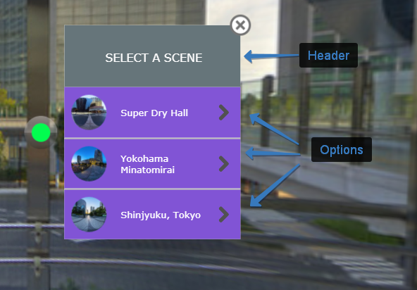
Open/close animation
Scale - scales container and its inner elements starting from
initial scalevalue.
On open the box will be scaled from initial to the normal scale value and vice-versa on close.
Default initial value is 0, the normal scale is 10 (Represents 1 in KRPano).
Initial scale params compare 0 and 9Scale with move - transforms width and height of the container starting from
initial width/heightvalues.
On open the box will be scaled from initial width and height to the original size value and vice-versa on close.
Default initial values for width and height are 0.
Initial scale with move params compare 0/0 and 200/300
Header settings
Sets header height, background color, text content, color, and font style.
Text supports HTML, for example, to split a long name into two lines add a line break element <br>.
Additional information about font style setting in the Font setting note
Close button settings
Sets image file, size, and position for the close button. The initial position of the close button is on the right-top corner of the options box.
The horizontal and vertical position offsets will be calculated from that initial point.
Additional information about image size setting in the Image size note
Option settings
Sets size, background color, and text settings for the options items.
Text supports HTML, for example, to split a long name into two lines add a line break element <br>.
Additional information about font style setting in the Font setting note
Add hover effect
Change the background color of the option on the mouse hovering.
Options separator settings
Sets height and color of the line between options.
Options thumbnail settings
The initial position of the thumbnail is on the left side of the option item.
The horizontal and vertical position offsets will be calculated from that initial point.
Use default thumbnail
Uses the default thumbnail image thumbnail.jpg generated by Panotour.
To use custom thumbnails disable this option and add custom png images named thumbnail.png next to the default thumbnail images thumbnail.jpg in the exported tour.
Thumbnail radius
Round corner settings for thumbnail images.
To set round thumbnail set radius value to the half of the set width and use square thumbnail image or make a square crop from the default thumbnail in the crop settings below.
Crop thumbnail
Set cropping for the thumbnail image.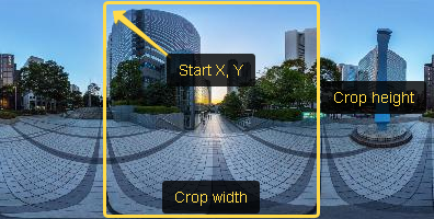
Options icon settings
Sets image file, size, and position for the icon of the option item.
The initial position of the icon is on the right side of the option item.
The horizontal and vertical position offsets will be calculated from that initial point.
Additional information about image size setting in the Image size note
Select scenes for the list of options
Options are added by adding go to panorama or group actions.
Every such action will be converted to an option using the target pano data.
The actions will be executed on the appropriate option click.
Font setting
The font option in the plugin settings shows all the fonts that are installed on the machine, however, the selected font may not be installed on the tour visitor's machine. Panotour automatically includes the selected font into the tour to make it available for any user, for this, the selected font should be placed to the Documents/Kolor/PanotourPro 2/fonts
Image size
It is recommended to create graphics in double size to support retina screens.
For example, if you want to use a button image with the size of 30x30px - create an image 60x60px and in the settings of the plugin width and height set 30.