Appearance
Notifications
Description
Create pano-specific messages or buttons using graphic files, and use actions to display/hide them, and interact with your virtual tour. The plugin has an option to display notifications with a click on a hotspot when displayed it sticks to the hotspot and rotates with a panorama.
Compatibility
PANOTOUR PRO 2.2 - 2.5.14 (HTML5)
Install
The Notification plugin is made available as a zipped file. Before installation, remove any previous version of the plugin. Unzip the downloaded package to any temporary folder.
The plugin consists of two folders: alpo.notifications-x.x.x and alpo-notifications-files.
Copy the alpo.notifications-x.x.x folder to:Windows C:\Users\MyName\Documents\Kolor\PanotourPro 2\pluginsMac /Users/MyName/Documents/Kolor/PanotourPro 2/pluginsLinux /home/$USER/Documents/Kolor/PanotourPro 2/plugins
Copy the alpo-notifications-files folder to the tools folder in your user directory.
To browse your user directory in Panotour Pro, go to Edit>Open User Directory. Open your file explorer.
The filepath will look like this:Windows C:\Users\MyName\Documents\Kolor\PanotourPro 2\tools
Restart Panotour to see the plugin!
Usage
You can add multiple instances of the plugin with different settings.
The plugin adds its actions available in the Panotour Choose actions>[Plugin] Notifications
Settings
Position
Sets the position, alignment, and offset you wish on your tour for the plugin.
Contents
The text content of the notification.
Avoid using characters: ', ", [, ], (, )
Headline
Notification headline text
Text
Notification text info.
Size
Width
Notification width, percentage or pixels.
Max Width/Min Width
Notification maximum/minimum width in pixels.
The width of the notification will change depending on the width of the screen until it reaches the Max/Min width. Max or Min width is applicable only if using a percentage for the Width setting.
Display
Notification style settings section
Select
Select Notification style. Available Predefined, Custom style, Custom Image
Predefined
Ready styles for notification.
Available styles: Success (green), Attention (Yellow), Error (Red), Info (blue)
Custom Style
Setup notification style. Text Color
Sets text color
Background Color
Sets background color
Roundness
Sets roundness of the notification background corners.
Border
Check to use borders around the background.
Border color
Sets border color Border With
Sets border width
Icon
Choose your own left-side icon file. Use png or jpeg image, 40x40 px.
To set up the notification without the icon, leave this field empty.
Close Icon
Choose the appearance of the close button.
Available:
- Standard grey (predefined grey close icon)
- Standard white (predefined white close icon)
- Choose file: Use your own icon (use png or jpeg image, 40x40 px).
Set as overlay
Set the current instance as the overlay screen.
This will set the height of the instance the same as the width. So, you can set a 100% overlay if needed.
To place the overlay behind another instance - set the lower Z Order value.
Custom image
Set an image as the notification.
File
Choose your image.
Tooltip settings
Use tooltip
Check to use tooltip with this notification. Tooltip gets Text data from the Contents section of the instance.
Position and offset
Changes position of the tooltip. The default position is 11px from the top of the image.
Transparency
Sets tooltip transparency.
Roundness
Sets roundness of the corners of the tooltip.
Choose style
Choose Dark or Light style for the tooltip.
Text Color
Sets text color.
Width/Height
Sets width and height of the tooltip. If set 0 then auto width and auto height will be used.
Show on mouse over
Check to show tooltip on mouse over the instance.
Show on click
Check to show tooltip on mouse click the instance.
Show on press
Check to show tooltip on press the instance.
Animation:
Available animation to show/hide notification: Fade and Move.
Slowdown animation
Value to slow the animation.
Use animation on close
Check to hide notification using the same animation effect.
Additional option for Move animation
- Use horizontal move - Notification slides horizontally.
- Use vertical move - Notification slides vertically.
Display conditions
Choose an event to display the notification. On pano/Tour start
Counts the delay after the tour/pano starts, then displays the notification.
Pano is fully loaded
Counts the delay after the pano is fully loaded, then displays the notification.
Before pano is fully loaded (Autohide)
Displays the notification before the pano is fully loaded, then hides it.
First interaction
Counts the delay after the first user interaction, then displays the notification.
No interaction
Count the time Delay of no user interaction with the tour, then displays the notification. Use this option only for one Notification in the project. If set for more than one Notification, then the last value will be used for all instances.
Enter fullscreen
Counts the delay after the fullscreen mode is entered, then displays the notification.
Hide on exit fullscreen
Check to hide the notification when the fullscreen mode is exited.
Exit fullscreen
Counts the delay after exit fullscreen, then shows the notification.
Hide on enter fullscreen
Check to hide the notification when fullscreen mode is entered again.
Show on click
The custom event which allows you to add a special action to display this notification to the plugins, such as "simple button", "toggle button". Works with any plugins or hotspots that you can add actions to.
There are three special actions: Show on click, Hide on click, Show stuck to hotspot You can find them in the actions menu Choose actions>[Plugin] Notifications.
Additional options for Display conditions
Show once
Check this box to show the notification only once. If you leave this unchecked, the notification will be displayed every time the selected event occurs.
Delay
Use delay value to snooze the event.
Autohide
Use delay value to auto-hide the notification.
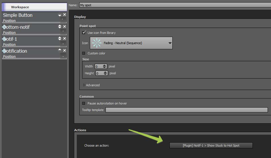
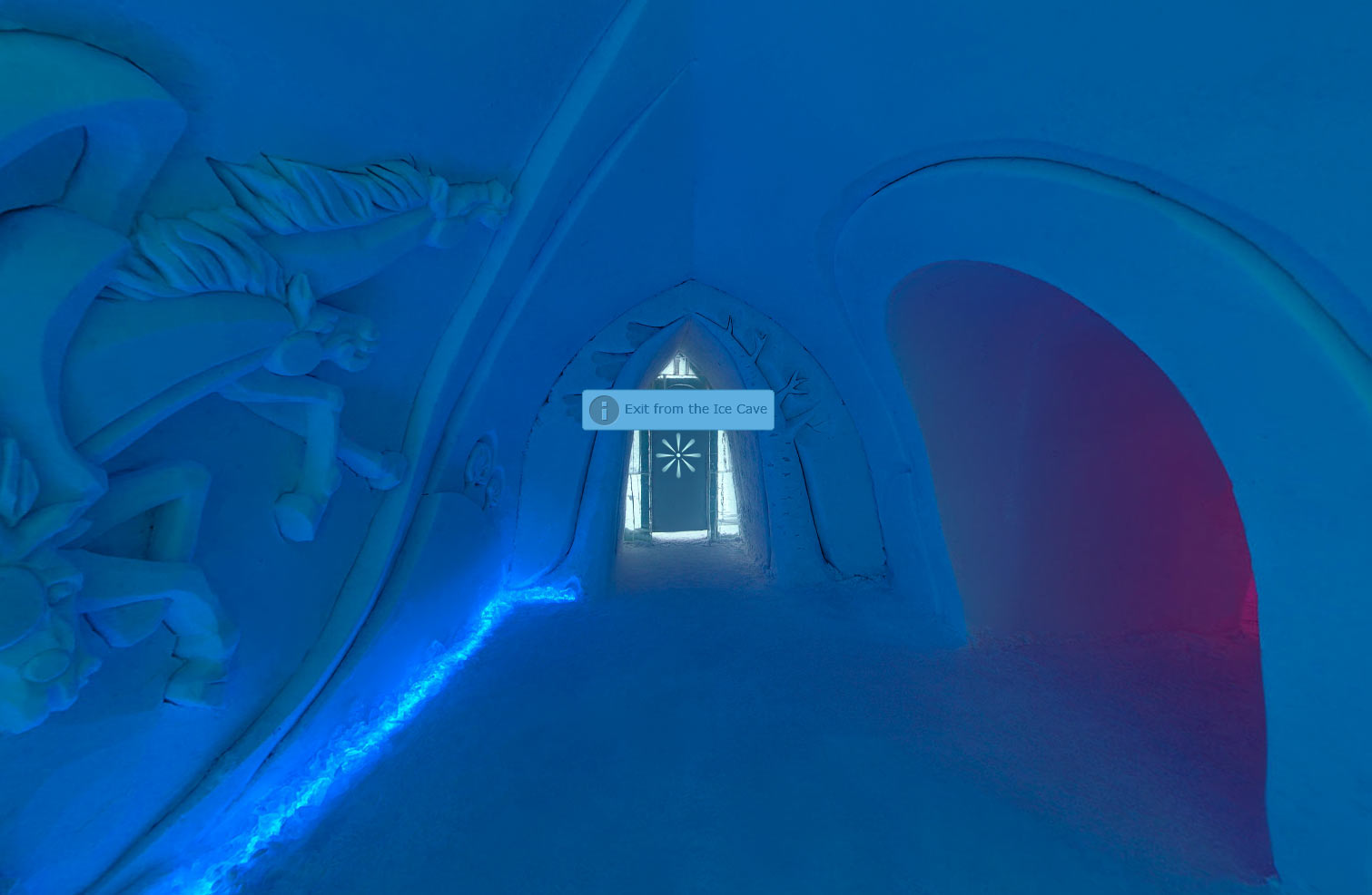
Show stuck to hotspot
Show appropriate notification instance stuck to the hotspot. The position of the notification will be related to the hotspot, but the percentage width is related to the screen.
In the hotspot actions list select notification instance, which you want to show and select action Show stuck to hotspot. For the Display conditions of in the notification set Show on click.
Select action
Stuck to hotspot result
INFO
If you added more than one notification, look at the workspace (left-side pane in Panotour) to get the name of the notification you need to display. You can name instances whatever you want, except one of them, see Renaming below for more info.
Renaming
The main name Notification is required to be assigned to one of the instances of the plugin.
Avoid using space in names.
If you've removed the instance with the main name from the project, assign the main name to another instance of the plugin.
Advanced
Keep notification if load new panorama
If checked, the notification will remain on screen while loading panoramas of the tour.
Make clickable
If checked, sets the notification clickable in order to close itself. The close button will be hidden.
Trigger actions on click
Use the Panotour action chooser to add any onclick actions.
The action will be executed on click the notification even if the previous Make clickable option is unchecked.
Specify pano(s) ID to show notification
The notification will be shown only in the specified panoramas. Enter Pano ID in the field.
You can add multiple Pano IDs on every notification. Click the "plus" icon to create a new field.
The ID of the pano is available in the TOUR tab. Click on the little blue information icon to open the information window.
Z Order
Setting for overlapping instances of the Notifications plugin. Organize instances on top of each other. The value should be between 0 and 100, no negative values. Default value: 70. The instance with a lower value will be behind the instance with a higher value.
Specify Devices
Choose preferred devices on which to display the notification. If the current device doesn't match your settings, then this notification will not be displayed.
All
Notification will be displayed on all devices.
Specify
Specify devices.
Choose conditions
If you select more than one condition, the notification will be shown only if all conditions match the current device.